
Dunya

Dunya Media Group Dunya Independently owned Pakistani television station, the translation of the company name simply means ‘world’, with all communication utilising Urdu, the country’s native language. While primarily focused on the domestic market, it is also positioned to be internationally accessible to all non-resident Pakistanis living abroad. This enables the expatriate community to remain […]
SBS Television
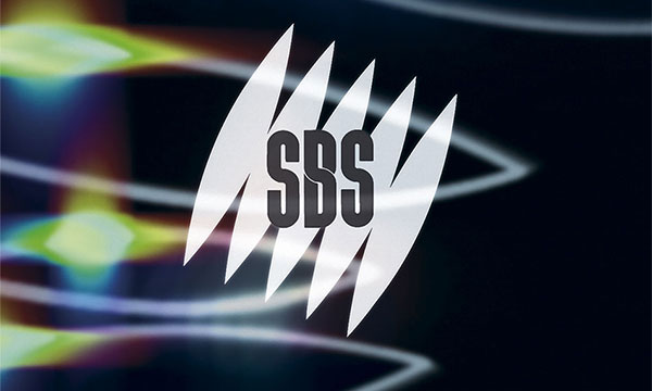
SBS Television The introduction of a multicultural television station brought with it global news and information inspiring the concept of opening up the world. The symbol was founded in an interpretation of the homolosine projection world map, orientated to the angle of the earth’s axis, 23.4°. The graphic forms of the laid flat globe provided […]
ARC Music TV
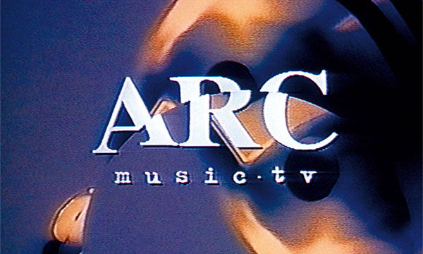
Austereo ARC Music TV With audience impatience and propensity for changing television channels, creating an identity for a music television channel prompted discussion about how to make the channel instantly identifiable to viewers. Numerous promotional ‘stings’ were produced to maintain freshness, but always maintaining the singular arc brand element. A curved line graphic interpretation of […]
Ocesa
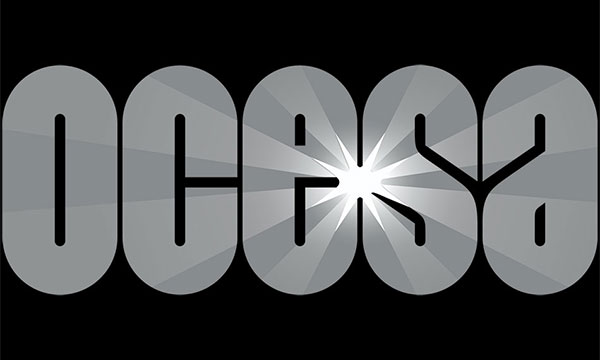
Grupo CIE Ocesa On the occasion of its 25th birthday, the world’s third largest entertainment and events production company decided to celebrate with a change of identity. Within the company name, the ‘es’ letters, the Spanish word for ‘is’, gave opportunity for the company to state that Ocesa is entertainment or to make the statement […]
Seven Network Australia
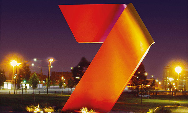
Seven West Media Seven Network Australia The visual history of an organisation can be successfully adapted to communicate its future direction. Since 1956, the Seven television network branding has evolved to reflect changes to the organisation and to its programming. Over the years, the figure seven has remained a constant, although in a number of […]
Working Title Films
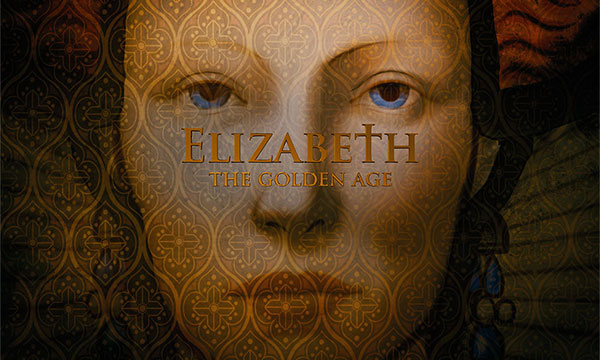
Working Title Films Often movie titles summarise the mood and storyline of the film. But with the movie Elizabeth: The Golden Age, the task was to also introduce the main characters, establish the political environment and accompanying issues in order for the audience to fully appreciate the movie to come. It seemed appropriate to follow […]
Propan

PT Propan Raya Propan In refreshing the identity for one of Indonesia’s largest paint manufacturers, a commitment was made to a single dominant corporate colour that would differentiate the company from its industry competitors and unify all packaging and communications. A campaign to introduce the reinvigorated brand and create a greater connection to the local […]
Hanyu

Hanyu Group Joint Stock Co Ltd Hanyu The Chinese diversified group of companies manufacture and supply washing machine and dishwasher core components, drainage pumps for household appliances, spa toilets, permanent magnet ferrite radial anisotropy, roto and special engineering, plastic products as well as automotive core components and micro-charged products. The master brand and each company […]
Miles Kyowa

Miles-Kyowa Co Ltd Miles Kyowa Trademark and brand identity for a Japanese joint venture. As both partners needed to be equally represented the identity embraced both the companies initials while reflecting the industrial chemical nature of their products. Miles-Kyowa Co Ltd Miles Kyowa Trademark and brand identity for a Japanese joint venture. As both partners […]
Trilliun

Trilliun Group Trilliun In the strategic development phase of the brand renewal for Trilliun, an Indonesian pipe manufacturer, there was opportunity to bring real meaning to their existing name. The company had numerous positive messages and reasons to purchase their products. With a bit of exaggeration, the idea of a trillion reasons was developed and […]